2022 BRAND GUIDE
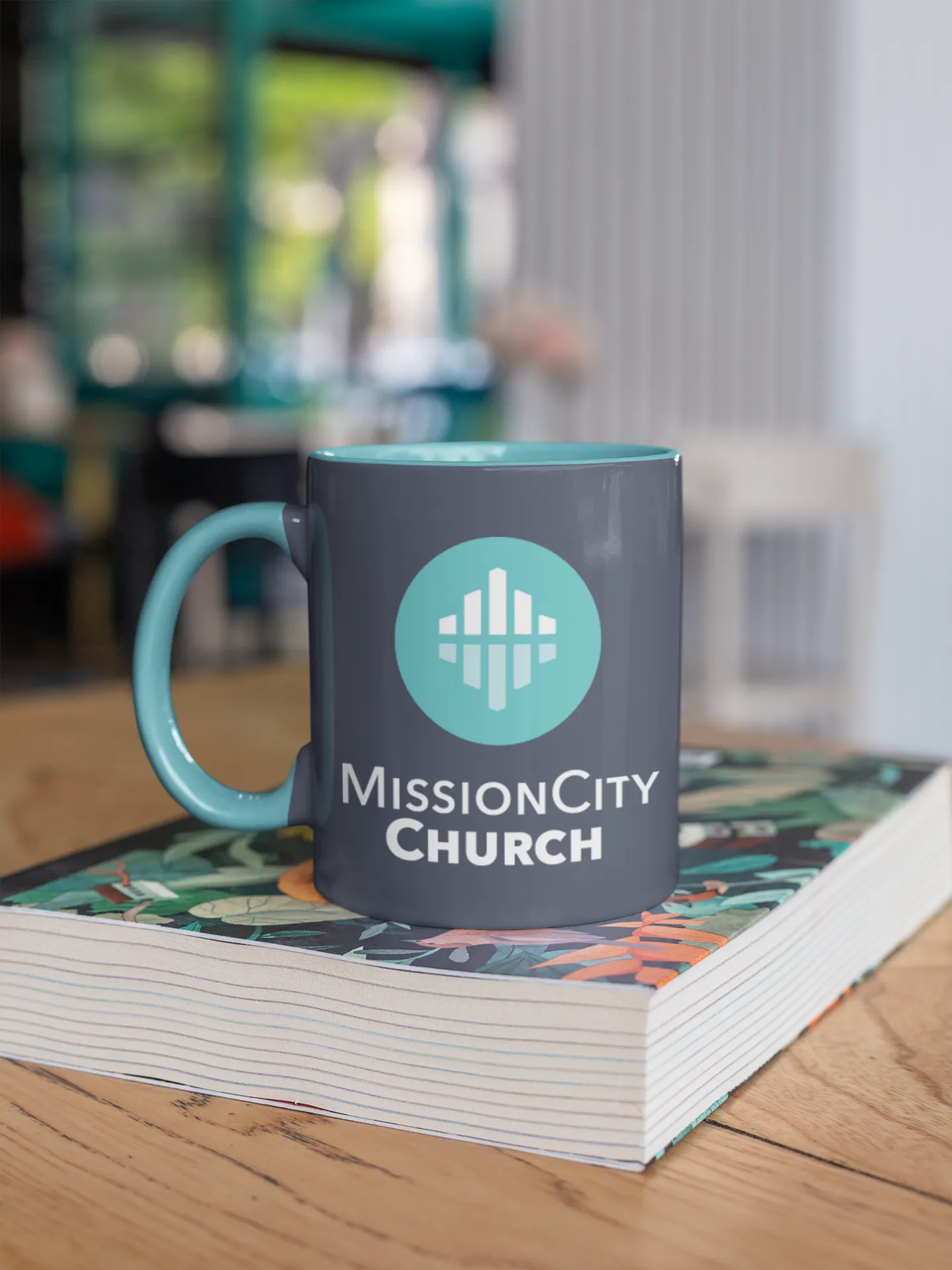
Featured Logo Styles


This style sheet is a reference for our internal design team, vendors, and others who are authorized to work with the Mission City Church brand.
Use the elements, artwork, and material within this document to make things that look like the Mission City Church brand, every time.
Though all of the brand elements are listed on this sheet, they may not be appropriate in every situation. Take great care in selecting the right visual element for the project.
For example, our primary brand logo should be used in the majority of applications, but in small spaces, the small format lockup is more legible.
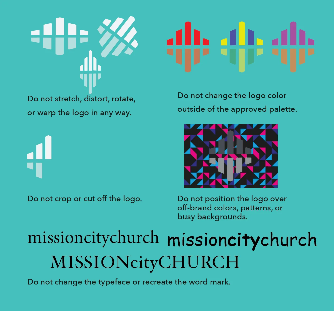
Any visual element, color, typeface, or logo that is not listed on this sheet requires approval from our design team. As always, please do not distort our graphic elements by changing the aspect ratio, shape, or color.
If you have any questions concerning the content of this style sheet, please don’t hesitate to reach out to our Design Team at [email protected].
WANT TO SEE IT IN ACTION?
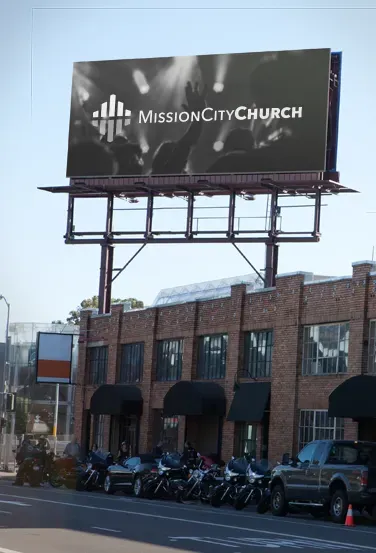
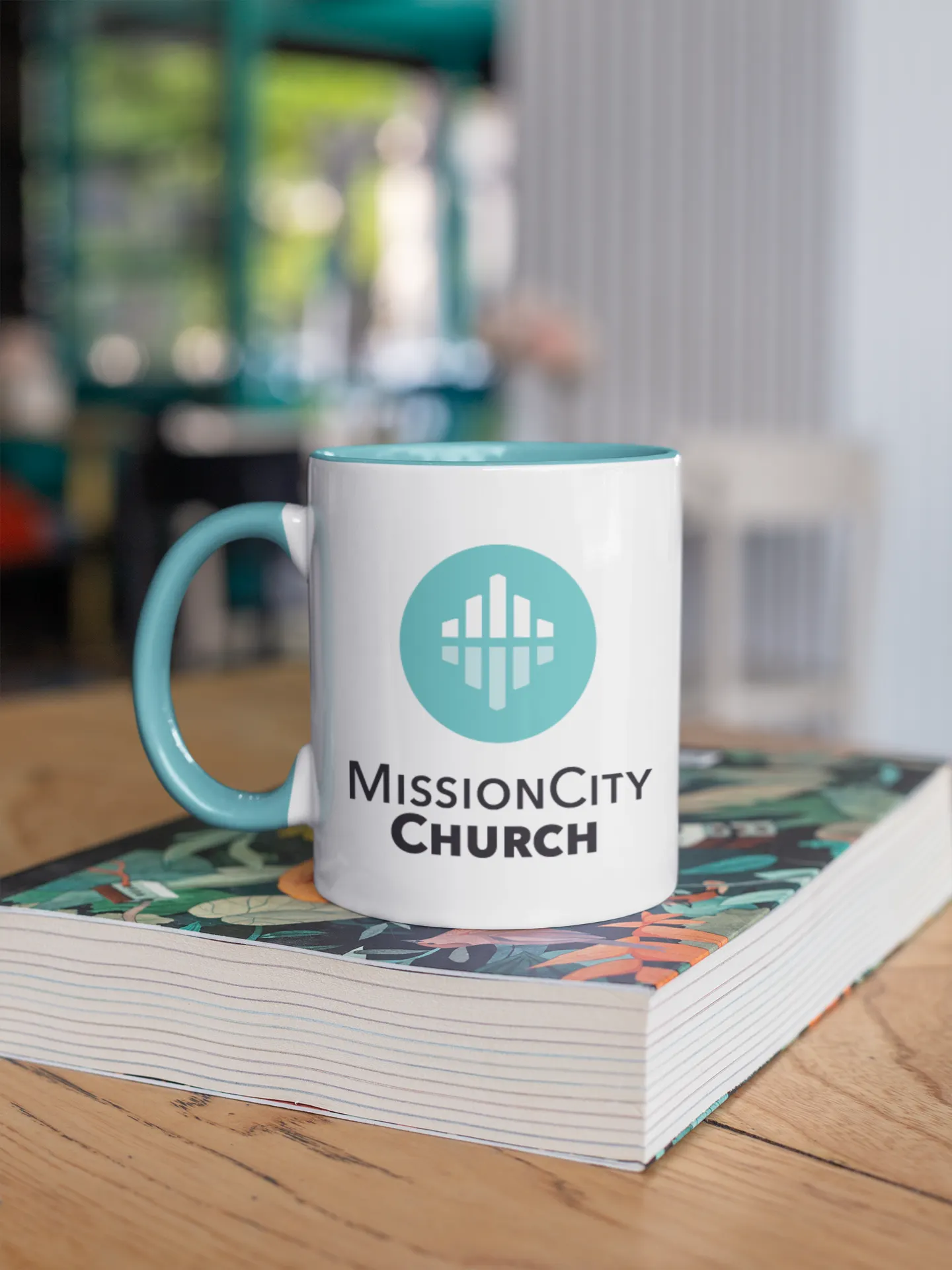
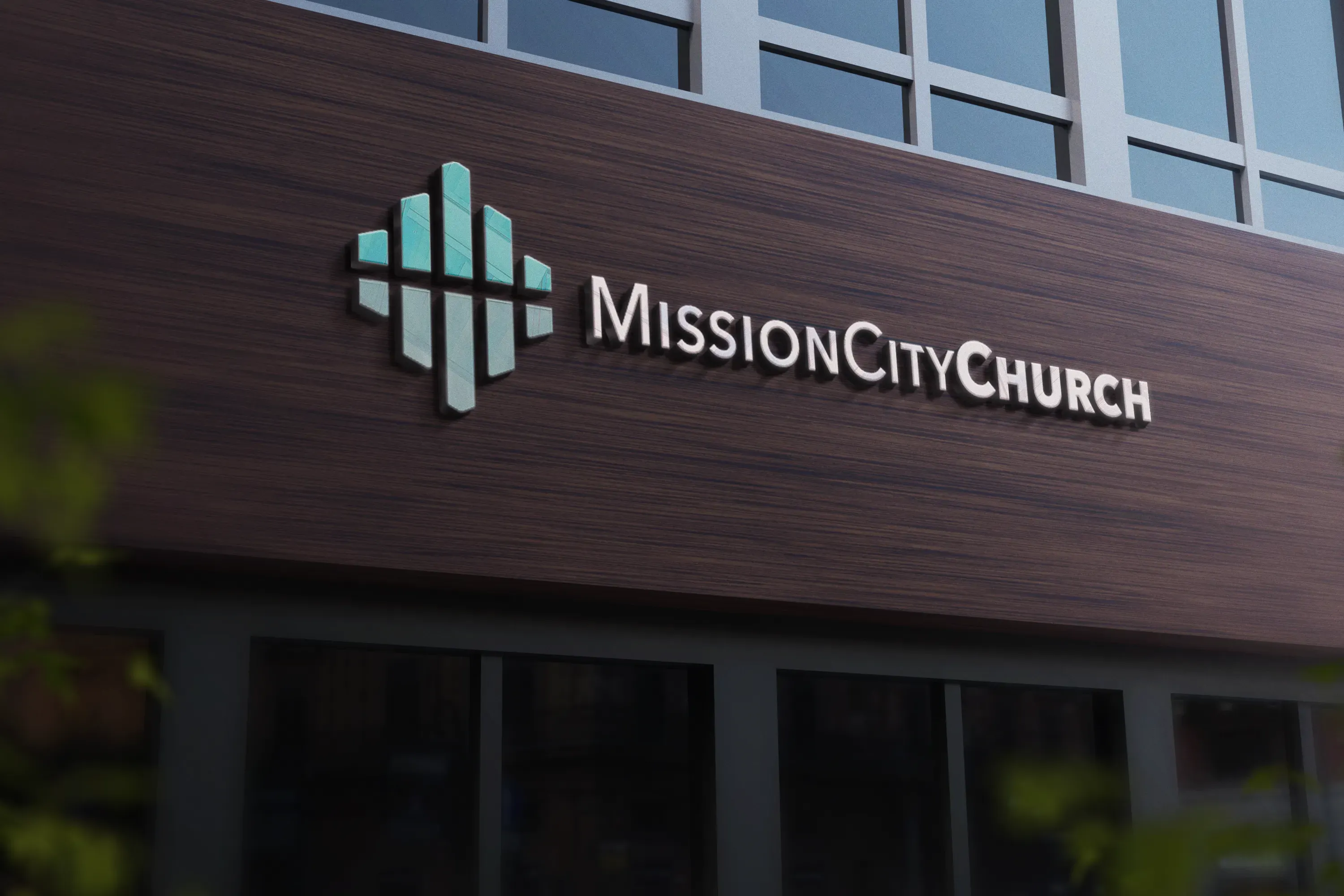
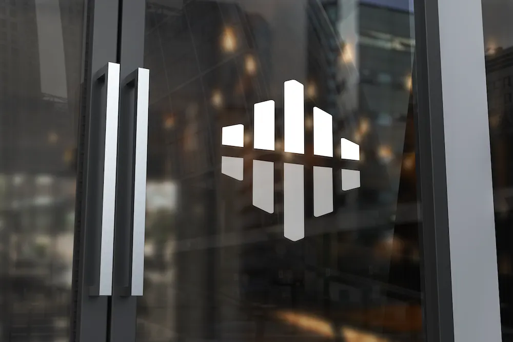
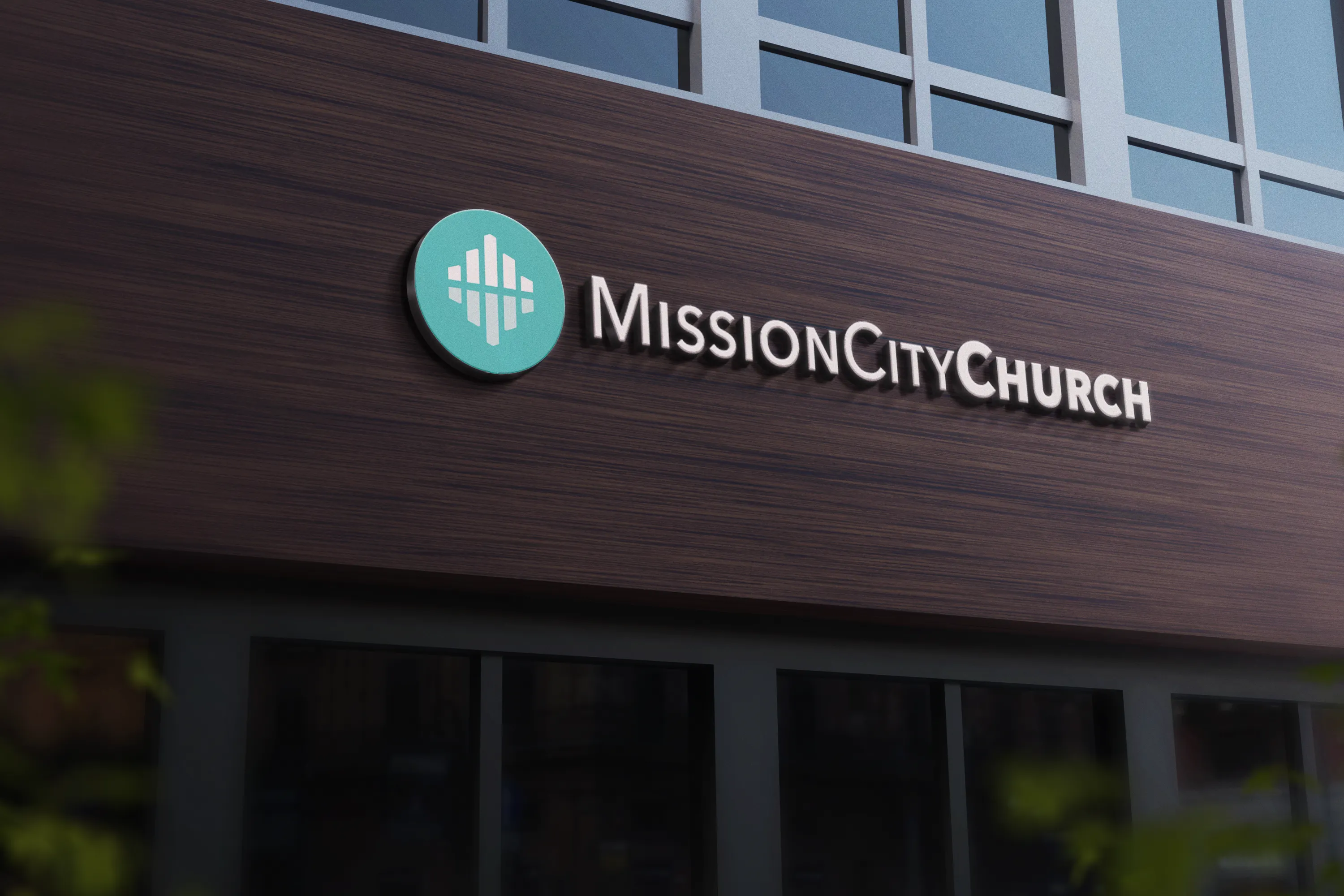
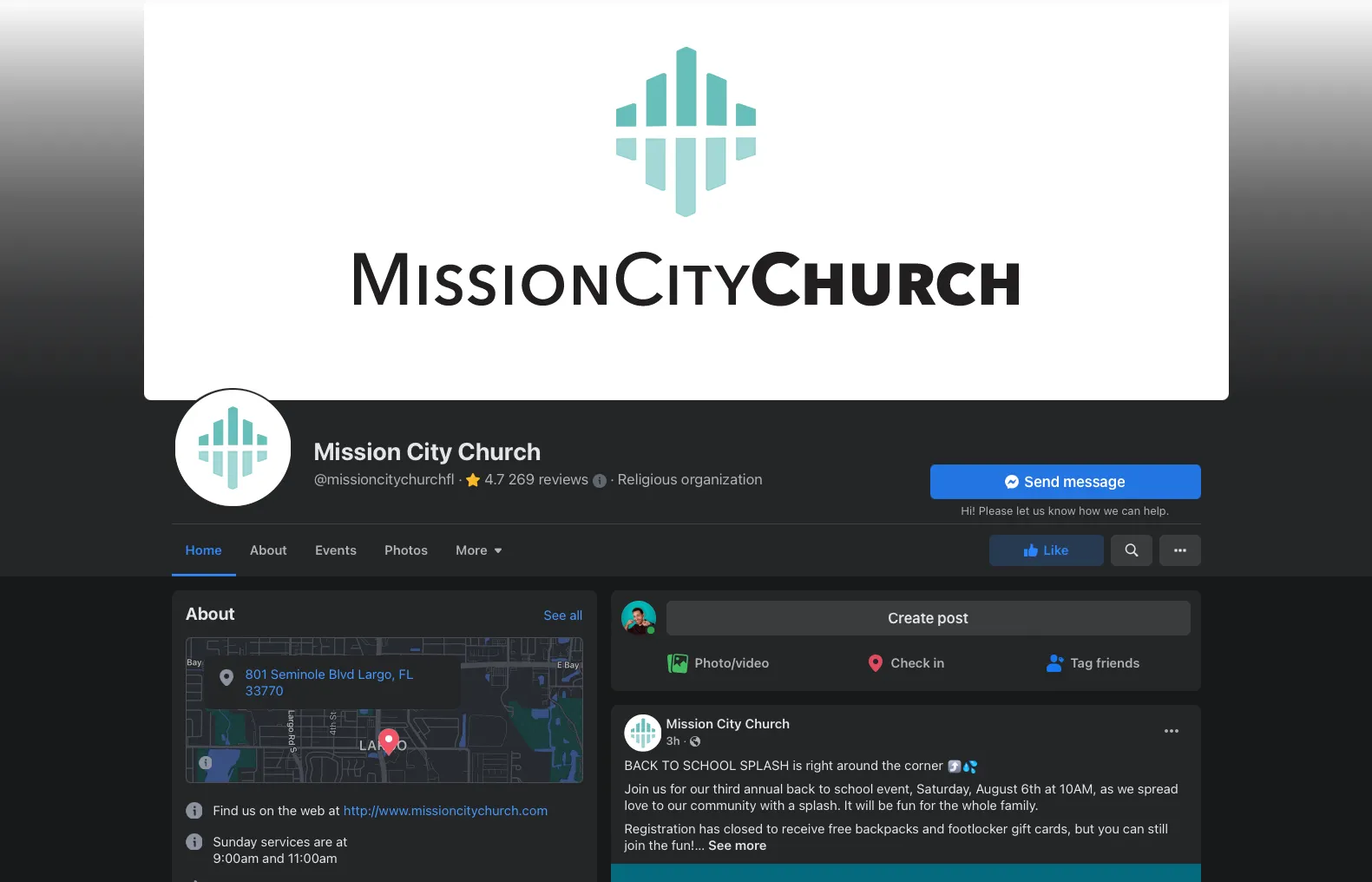
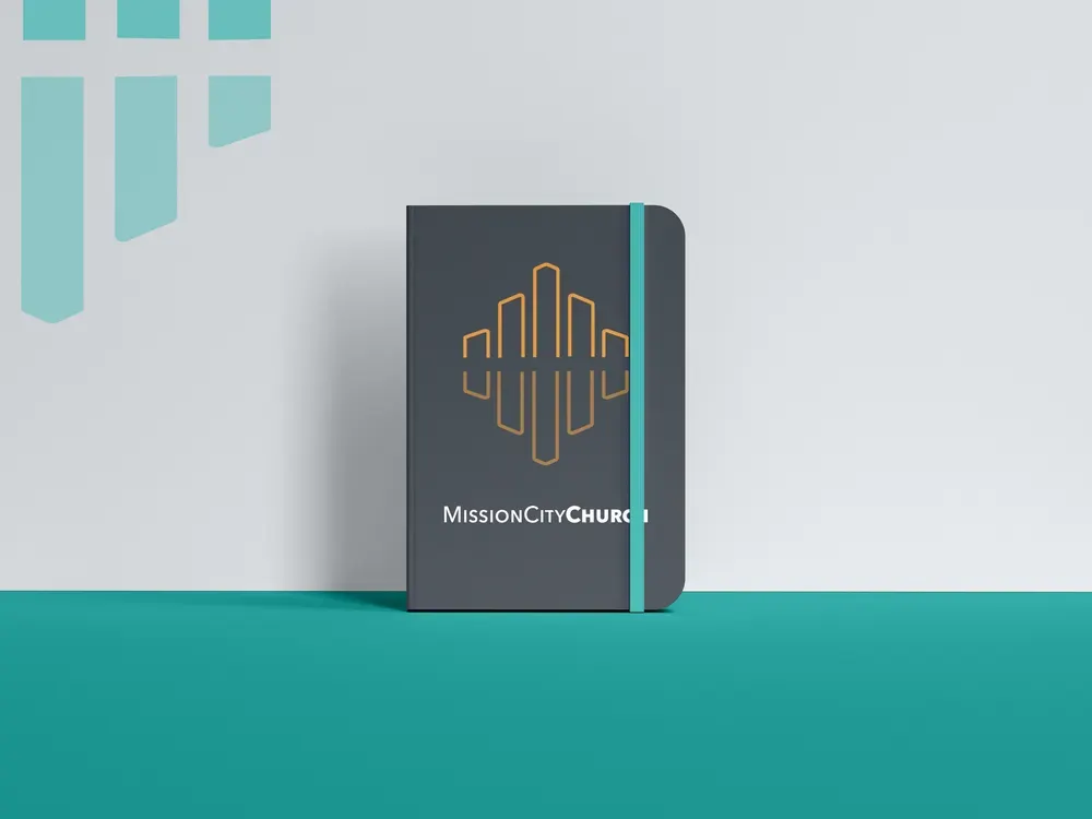
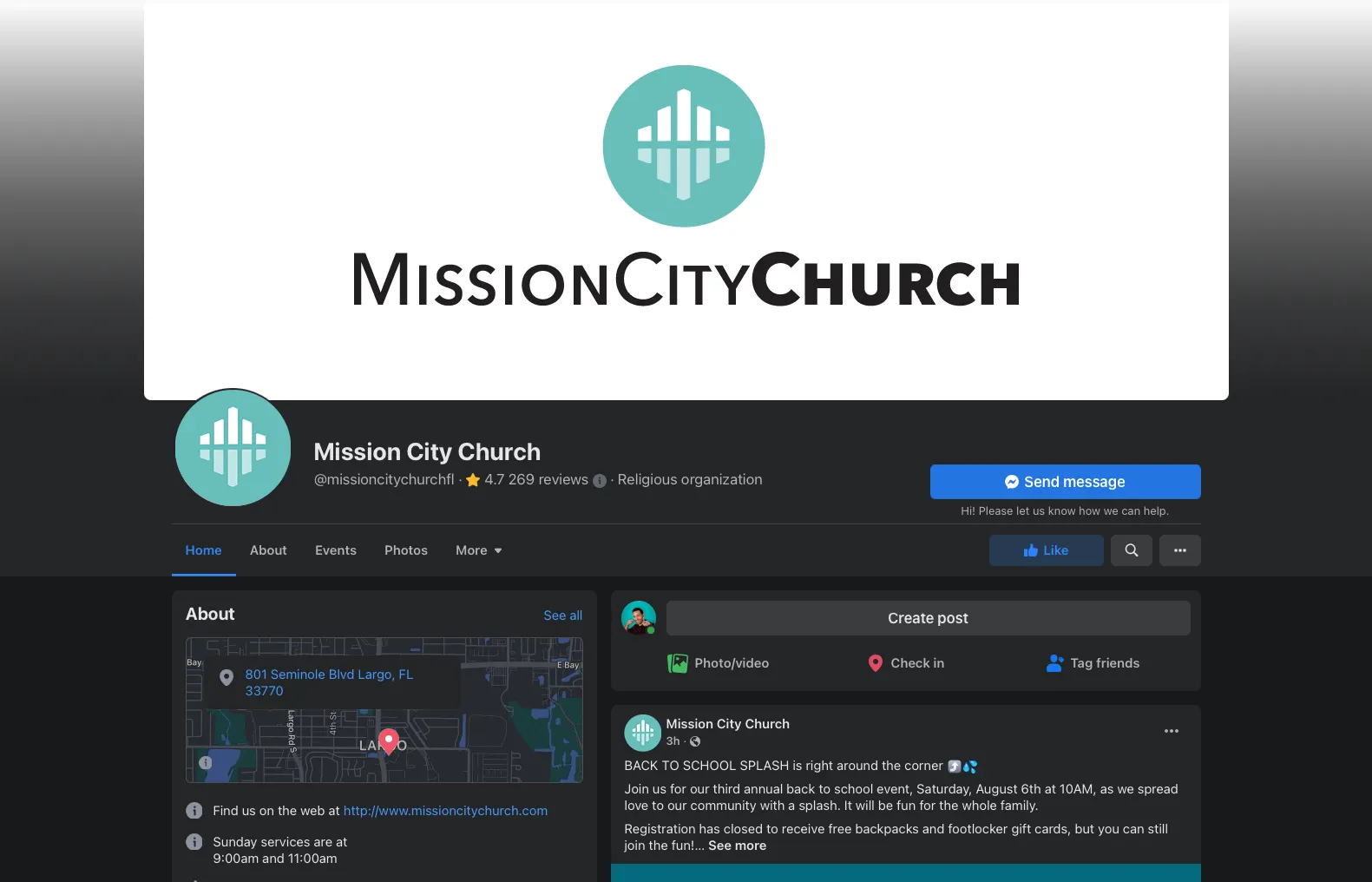
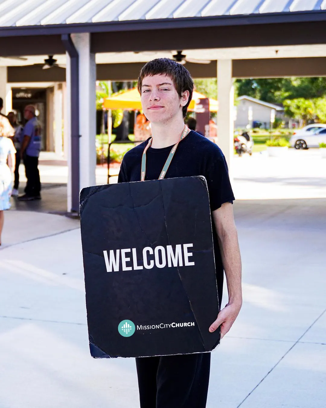
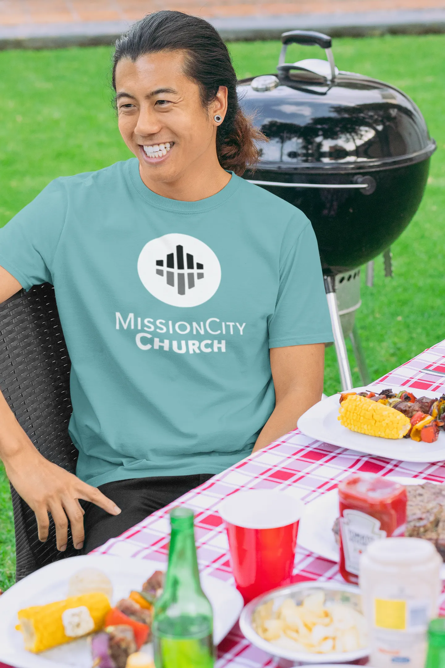
Here is a glimpse of the band in use:
Billboards
Signage
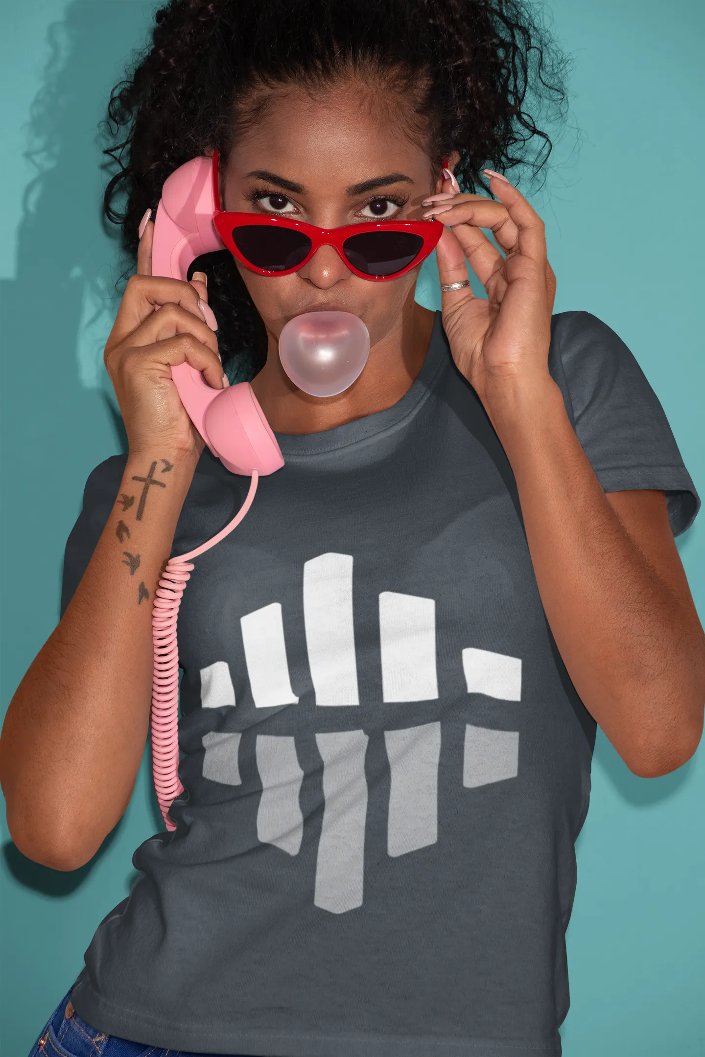
Apparel
Dark Background
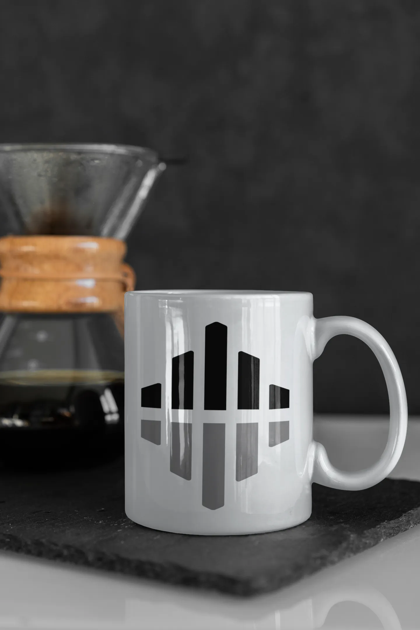
Artistic Logo Mark
Light Backgroud
Building Sign A
Door Vinals
Building Sign B
Digital Signs
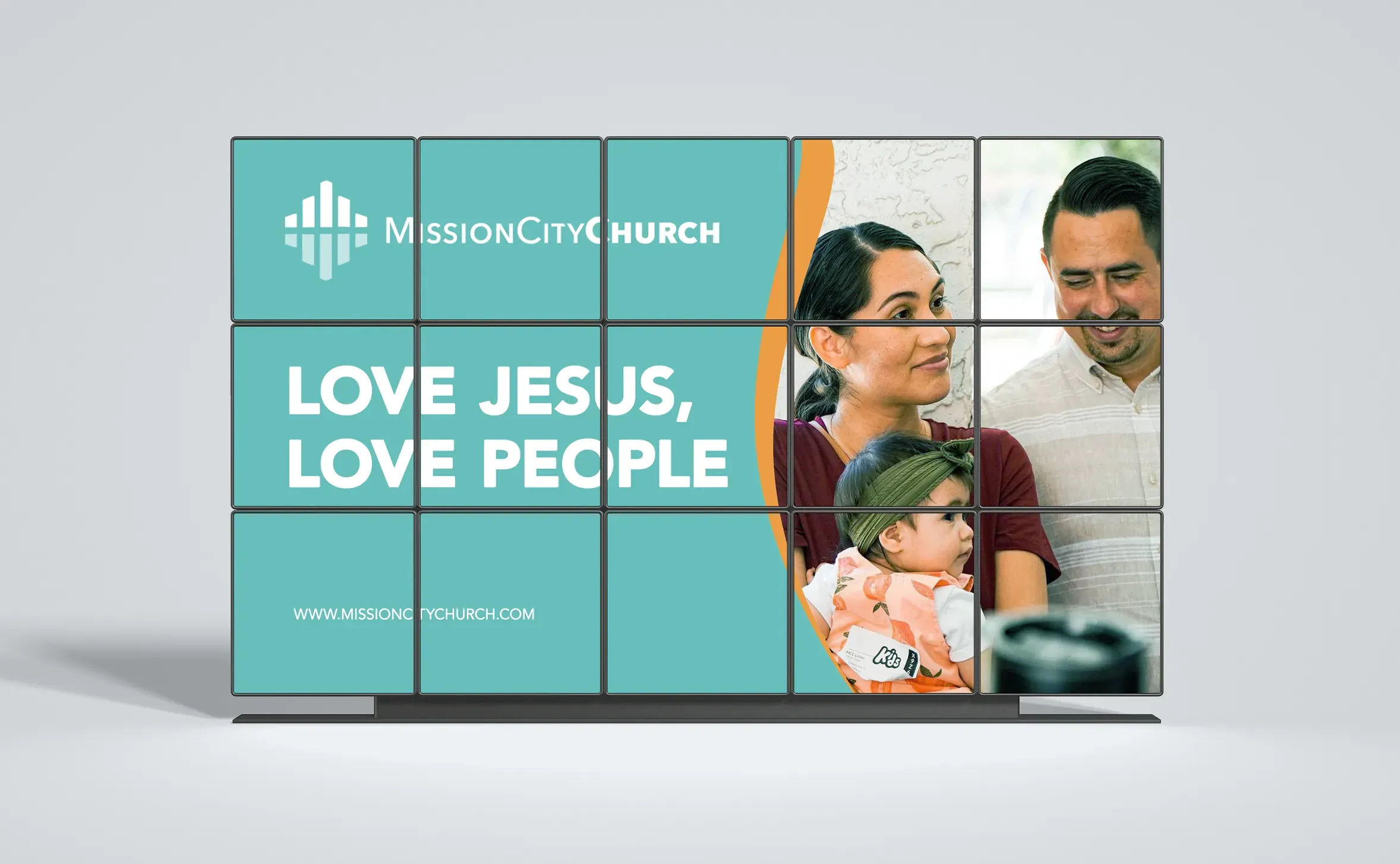
Be Seen Everywhere
Tie Into What Works!

Facebook Style A
Notebook Outline
Facebook Style B
Welcome Signs
Styles

Colors
VOICE, MISSION, AND VISION
At Mission City, our main goal is to do “whatever it takes” to help people find and follow Jesus. Our brand is meant to reflect the truth found in Jesus Christ that we stand for. We are bold and upfront with everything we do. Whether it be in worship, teaching, fellowship or our branding and copywriting, we aim to show the love of Jesus to others. When creating content for our brand, think about the following statements.
WE ARE:
BOLD, UNASHAMED, PASSIONATE, DOERS
WE ARE:
BOLD, UNASHAMED, PASSIONATE, DOERS
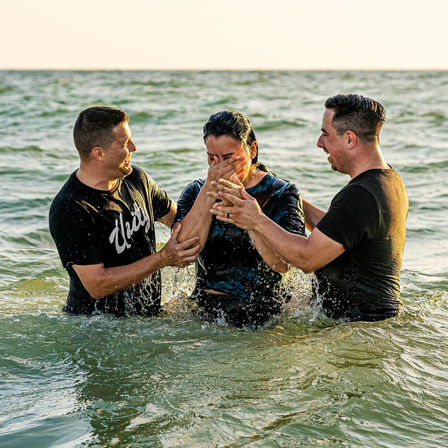
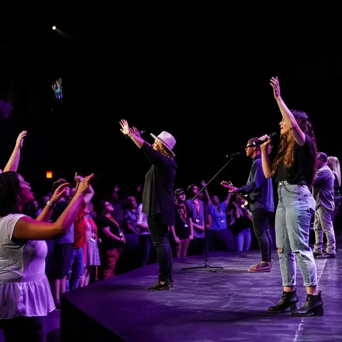
YOUR PHOTOS TELL STORIES
They represent your voice and speak to who you are and and how your audience sees you
Happy | Caring | Life Changing | Family | Community | Wisdom | Confidence | Comfort


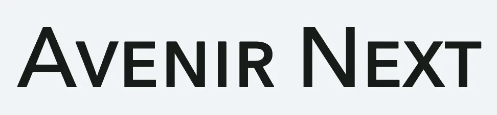
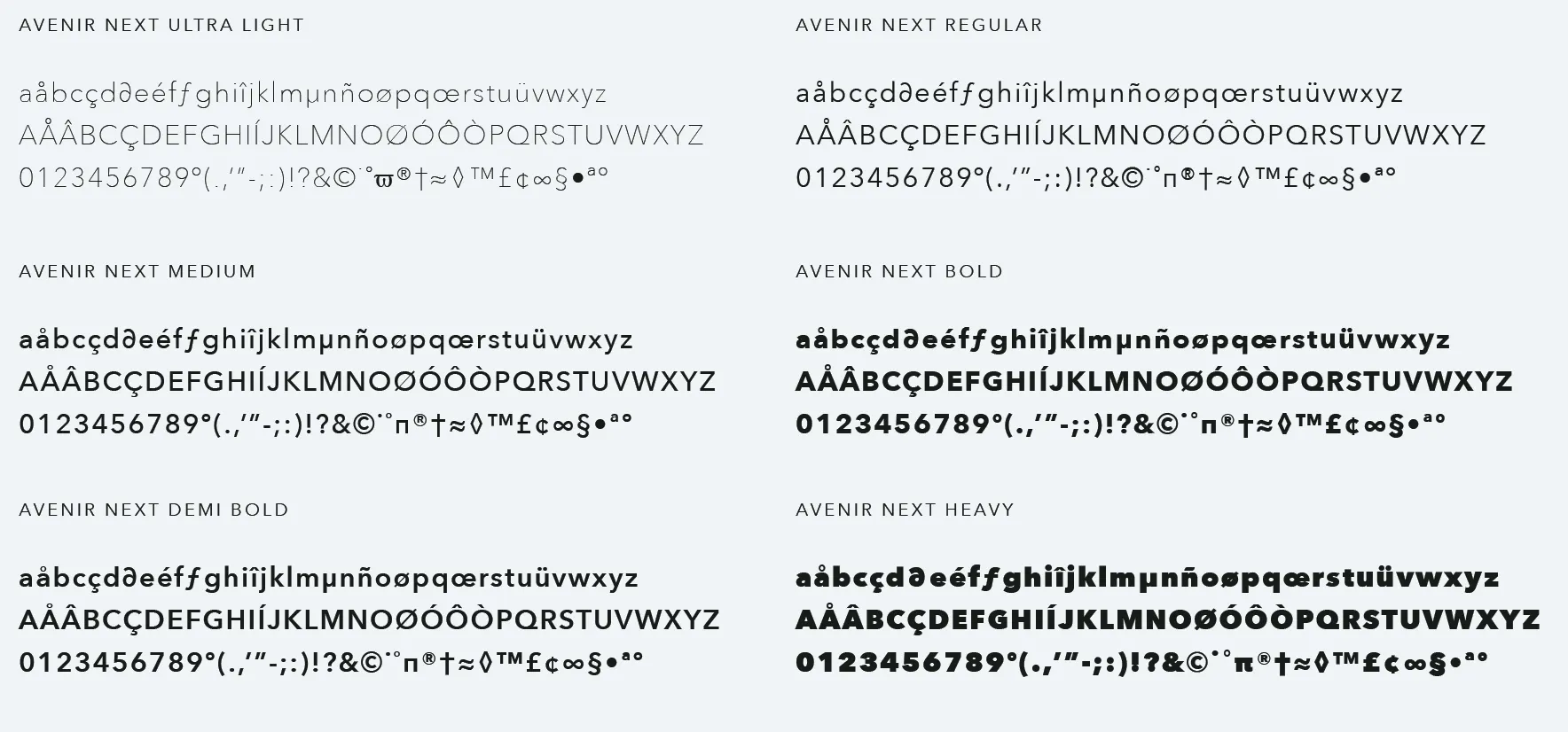
FONT AND TYPOGRAPHY
Avoid using other fonts unless exception is made by creative staff for special circumstances or as an accent.

YOUR COLORS
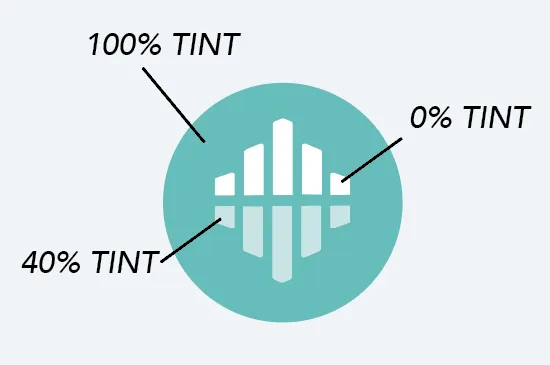
If necessary, use a 20% tint step system, keeping legibility in mind.
Any tint below 60% that is used as a background will require dark text.
Lagoon Rock
PMS 7472 C
CMYK: 63, 0, 2, 25
RGB: 71, 191, 187
HEX: 47bfbb
#6bcbc8
#90d8d6
#b5e5e3
#ecf8f8
TINT SCALE (80%, 60%, 40%, 20%)
Chat Orange
PMS 2012 U
CMYK: 0, 39, 77, 3
RGB: 248, 151,5 7
HEX: f89739
#f9ab60
#fac088
#fcd5af
#fdead7
TINT SCALE (80%, 60%, 40%, 20%)
Thunderbolt Blue
PMS 174-15 C
CMYK: 17, 08, 0, 69
RGB: 70,77,84
HEX: 464d54
#6b7076
#909498
#b5b7ba
#dadbdc
TINT SCALE (80%, 60%, 40%, 20%)
Springtime Rain
PMS P 115-1 C
CMYK: 3, 2, 0, 4
RGB: 237, 241, 245
HEX: edf1f5
Midnight Black
PMS 900U
CMYK: 21, 0, 10, 89
RGB: 23, 29, 26
HEX: 171d1a
TINT SCALE
Alternative Logo Styles
These are approved logo styles for various artistic and creative needs:


BRANDING MISUSE
These are things you should NOT do with the logo
in order to maintain the integrity of the branding