Grace Family
Church
A New Logo
for a New Season
THE VISION
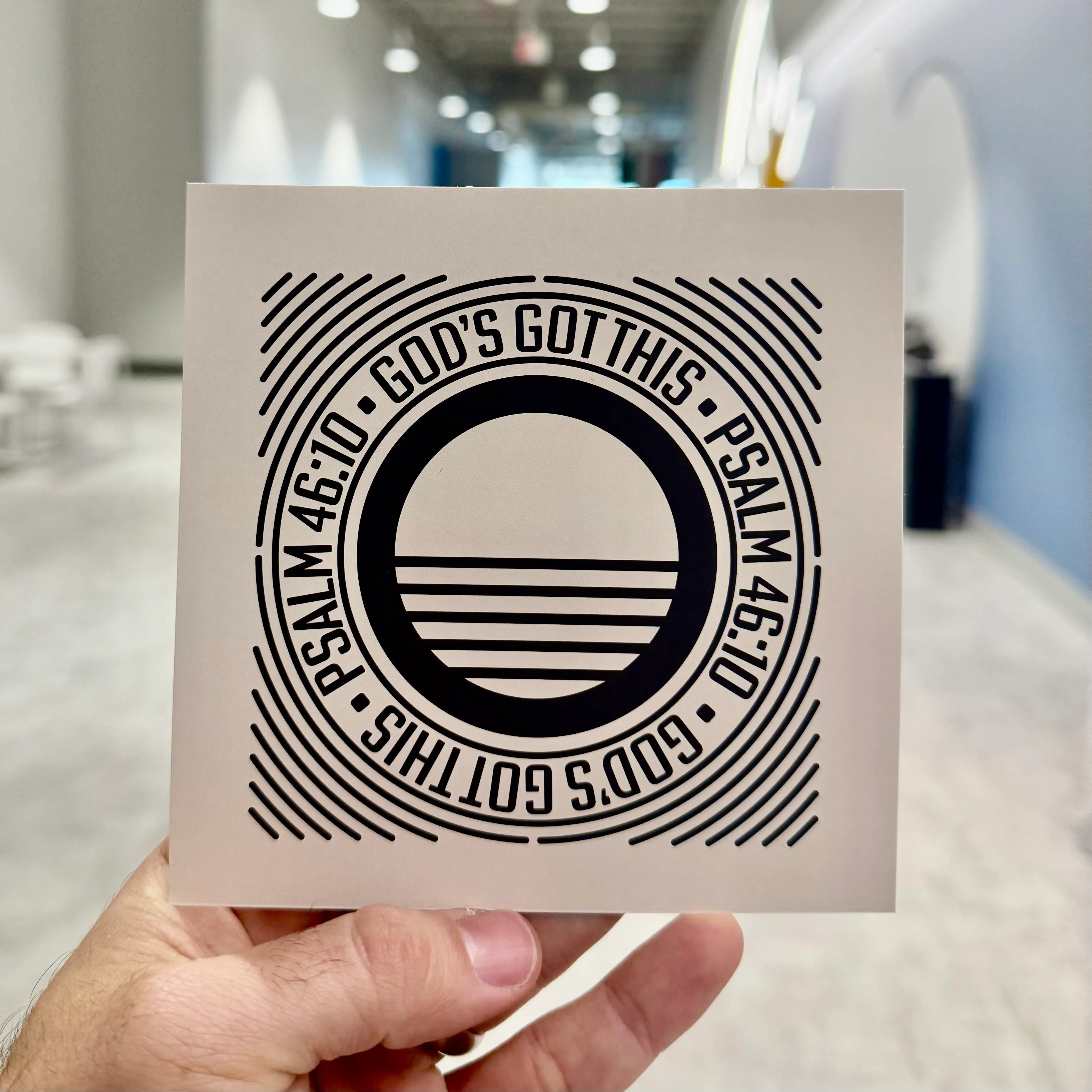
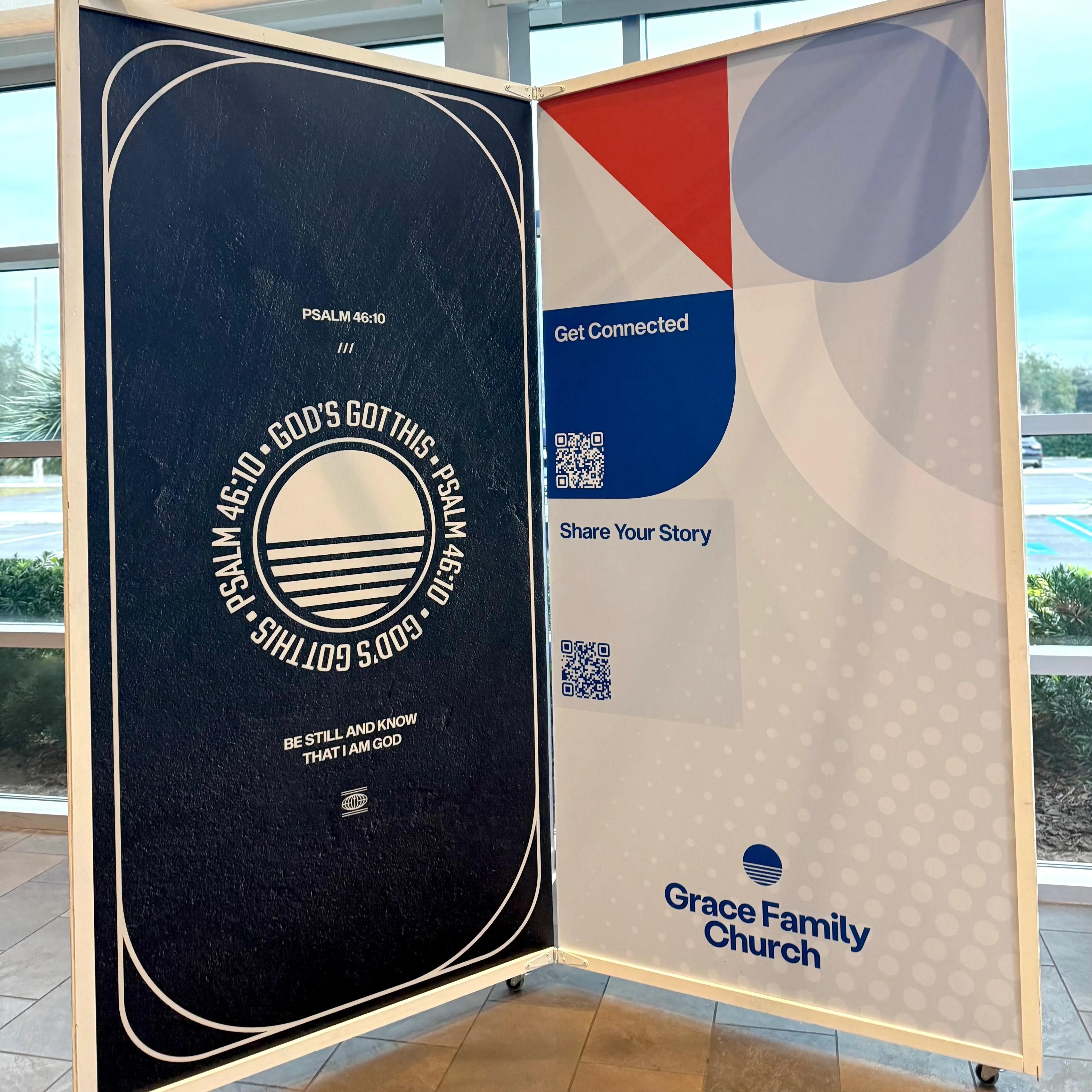
For over 31 years, Grace Family Church has been a place where families come together to follow Jesus. As the church continued to grow and impact lives, it was time for a visual identity that reflected this journey. The new logo represents a fresh chapter, honoring the past while stepping into the future with clarity and purpose.
THE DESIGN PROCESS
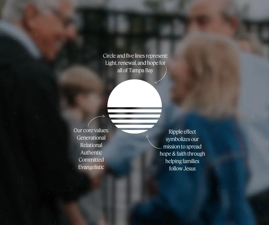
When designing the new logo icon, I wanted to ensure it aligned with the heart and mission of Grace Family Church. The process involved deep collaboration, research, and a commitment to capturing the essence of who they are.
Key elements of the new icon:

-
Simplicity & Strength: A clean, bold design that remains timeless and versatile across different platforms
-
Symbolism: Meaning in each part, from unity and connection to growth and transformation
-
Legacy & Future: A fresh take on the church’s identity, ensuring continuity while embracing the next season for years to come
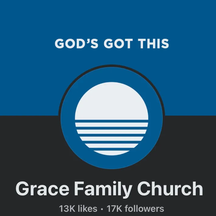
THE IMPACT
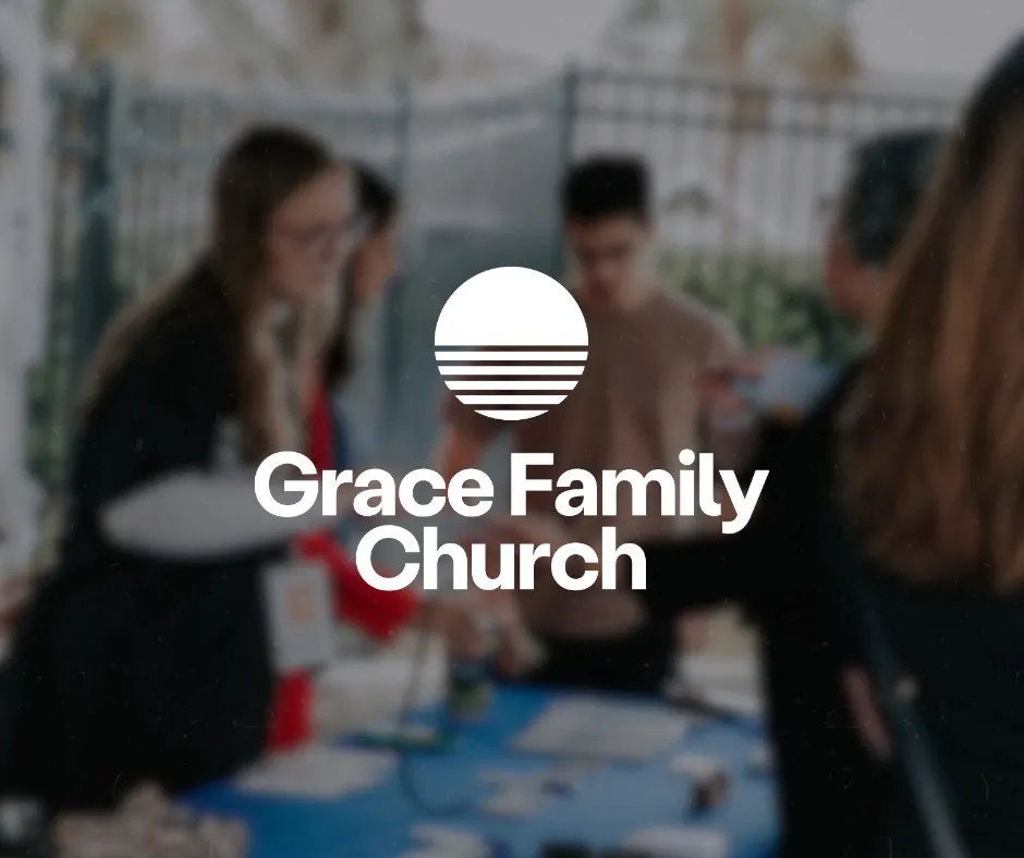
The new branding has already made an impact, creating a unified look that resonates with the church family and the community. As Grace Family Church moves forward, this logo serves as a visual reminder of its mission: to help families follow Jesus and experience life-changing faith.
Let’s Create Something Meaningful
I’m honored to have played a role in this rebrand and would love to help others bring their vision to life. If you’re looking for impactful branding, visit Outdo.Life to learn more.